This website uses cookies so that we can provide you with the best user experience possible. Cookie information is stored in your browser and performs functions such as recognising you when you return to our website and helping our team to understand which sections of the website you find most interesting and useful.
Locanda Appennino
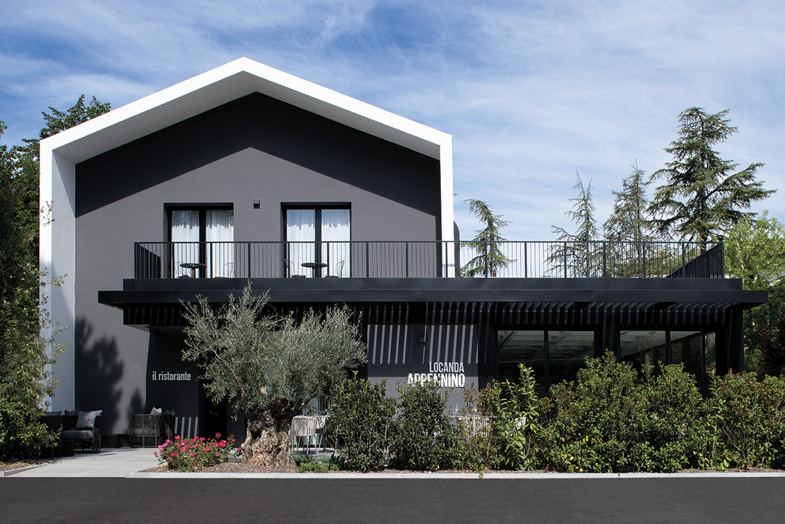
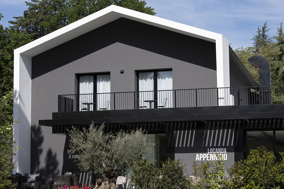
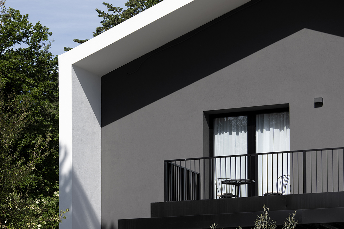
Monochrome with an extreme game of contrasts.
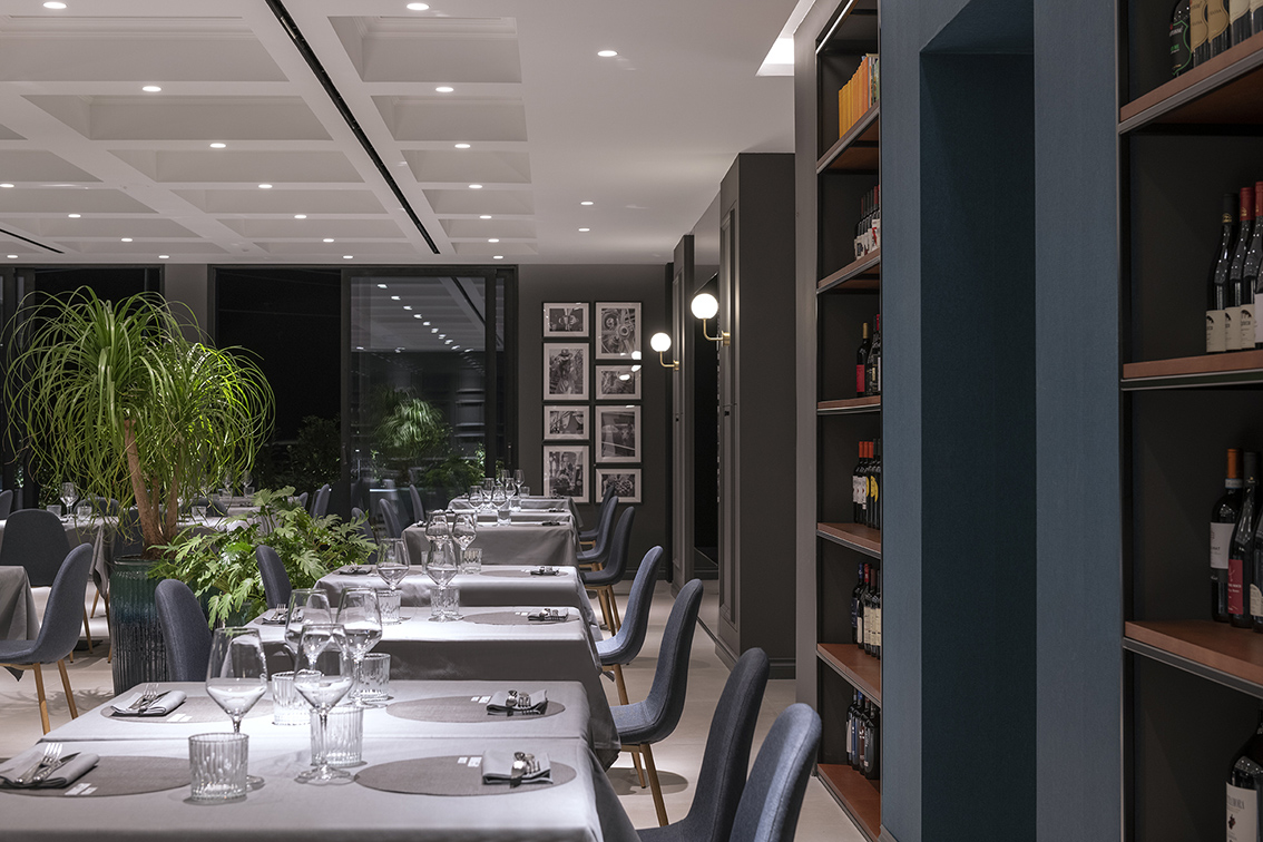
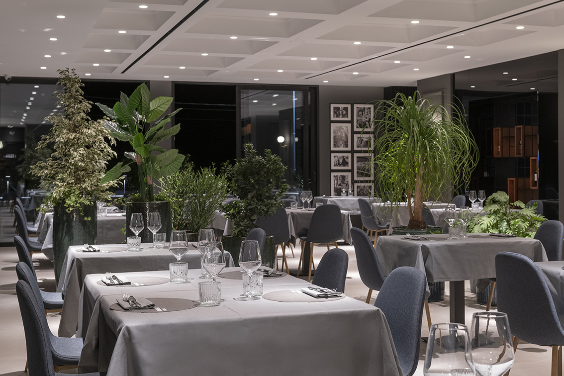
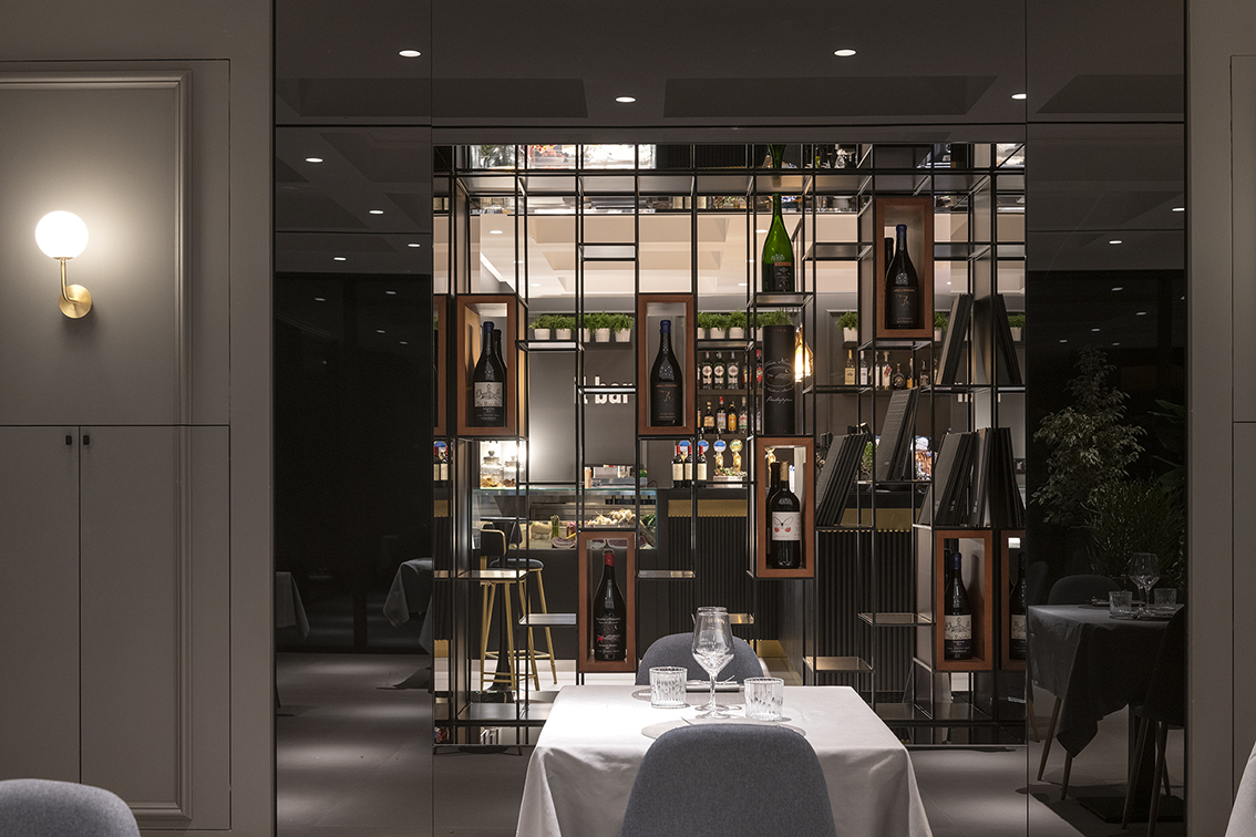
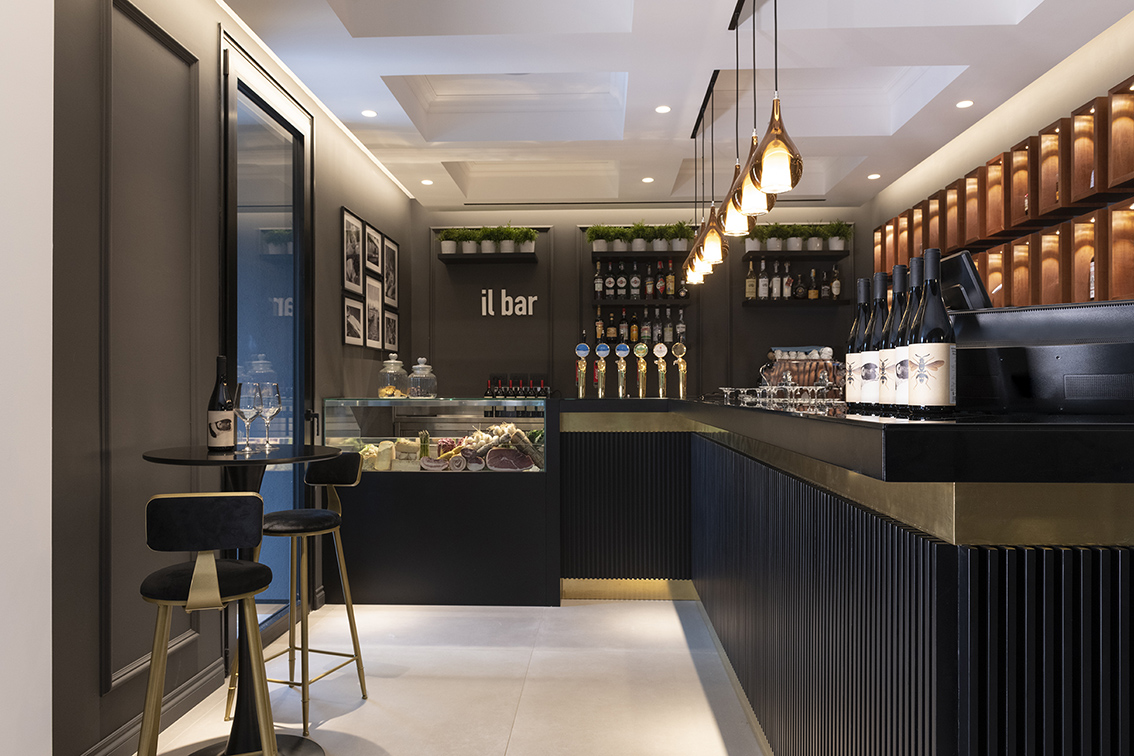
Locanda Appennino is designed with the intention of creating a space that is experiential in the customer’s mind by increasing the value of the service and doing so increasing the value of the place.
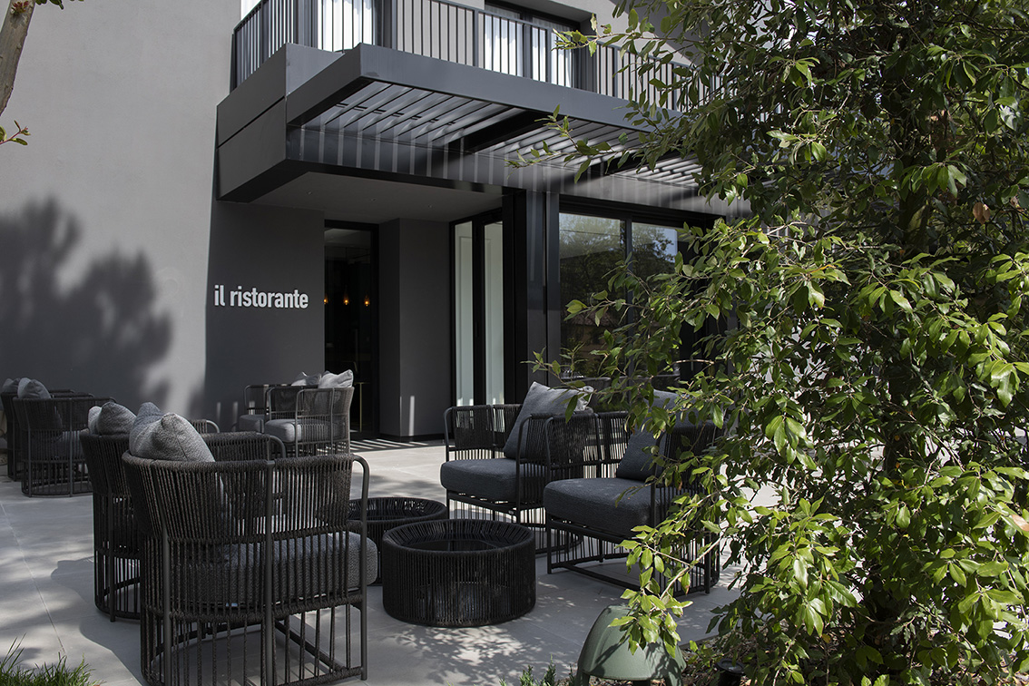
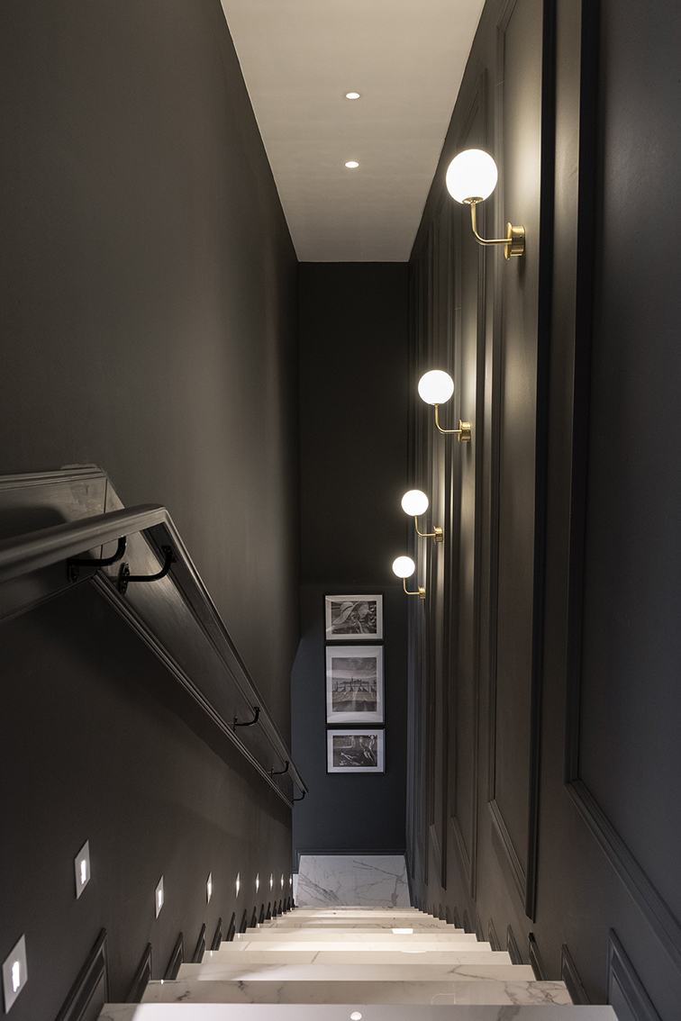
Great emphasis has been placed on the use of a few but precious materials such as stone, marble and glass with a search for alternating full and empty, simple and functional, classic and elegant.
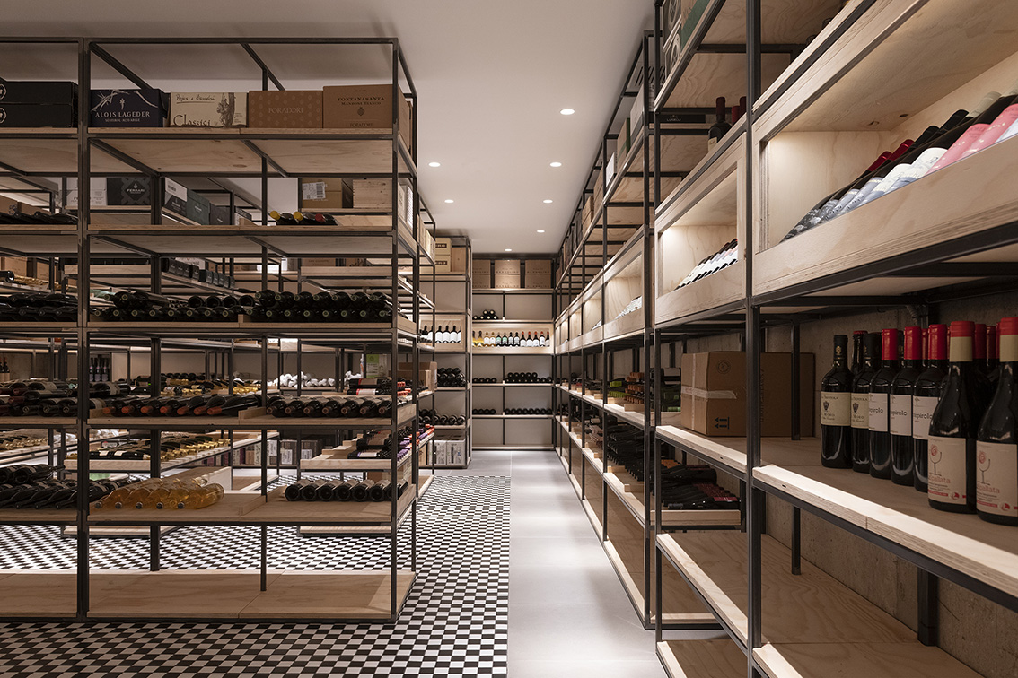
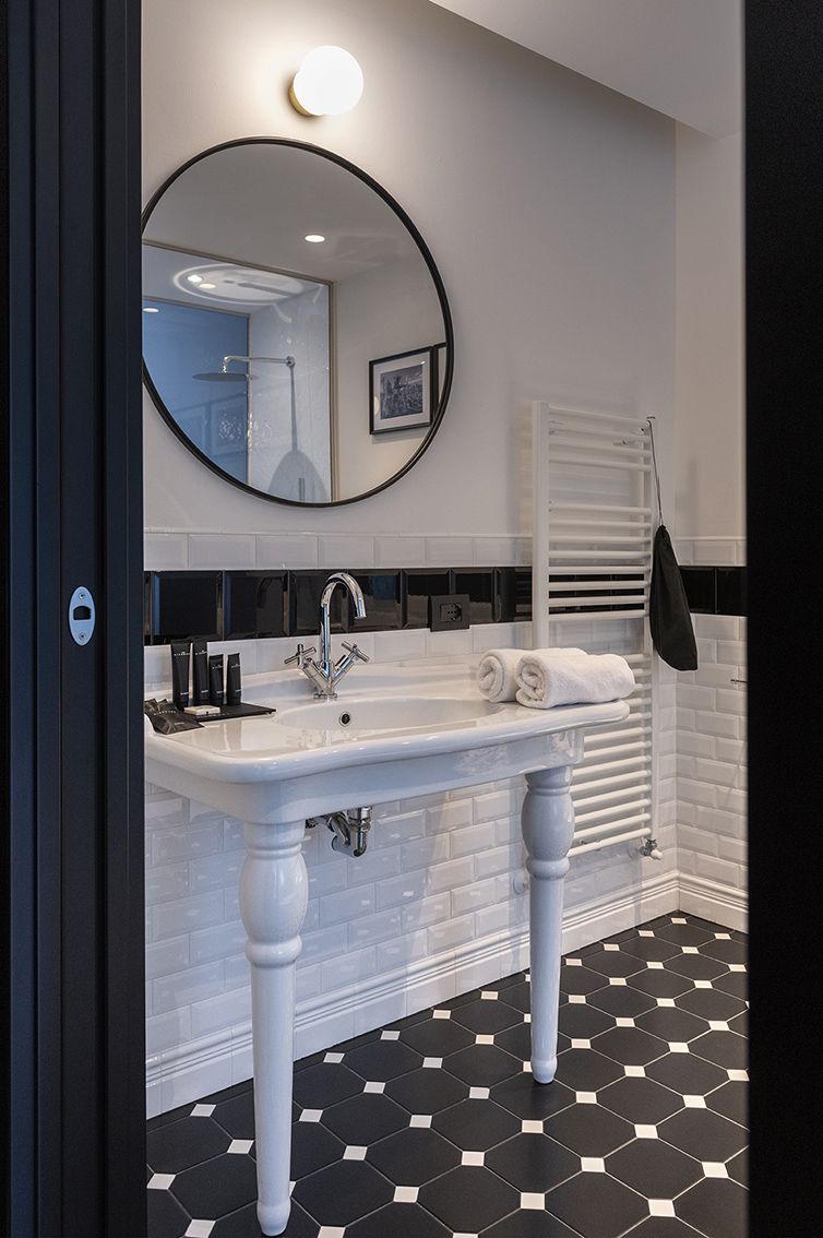
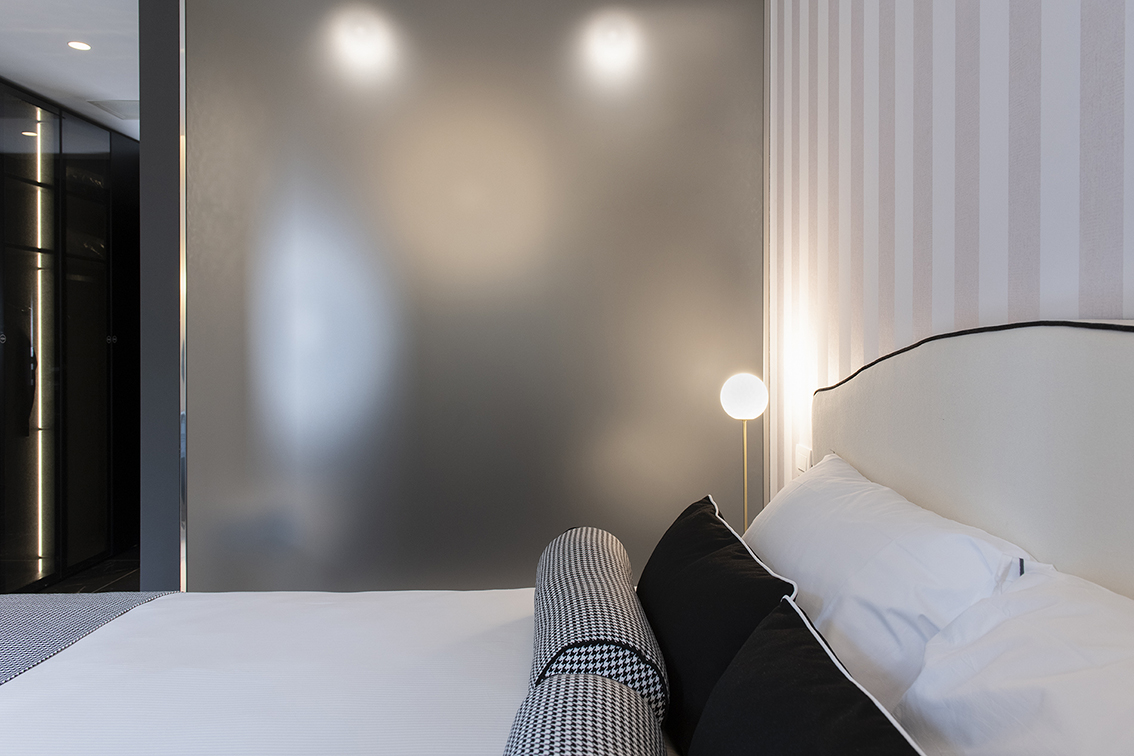
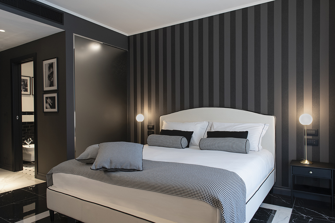
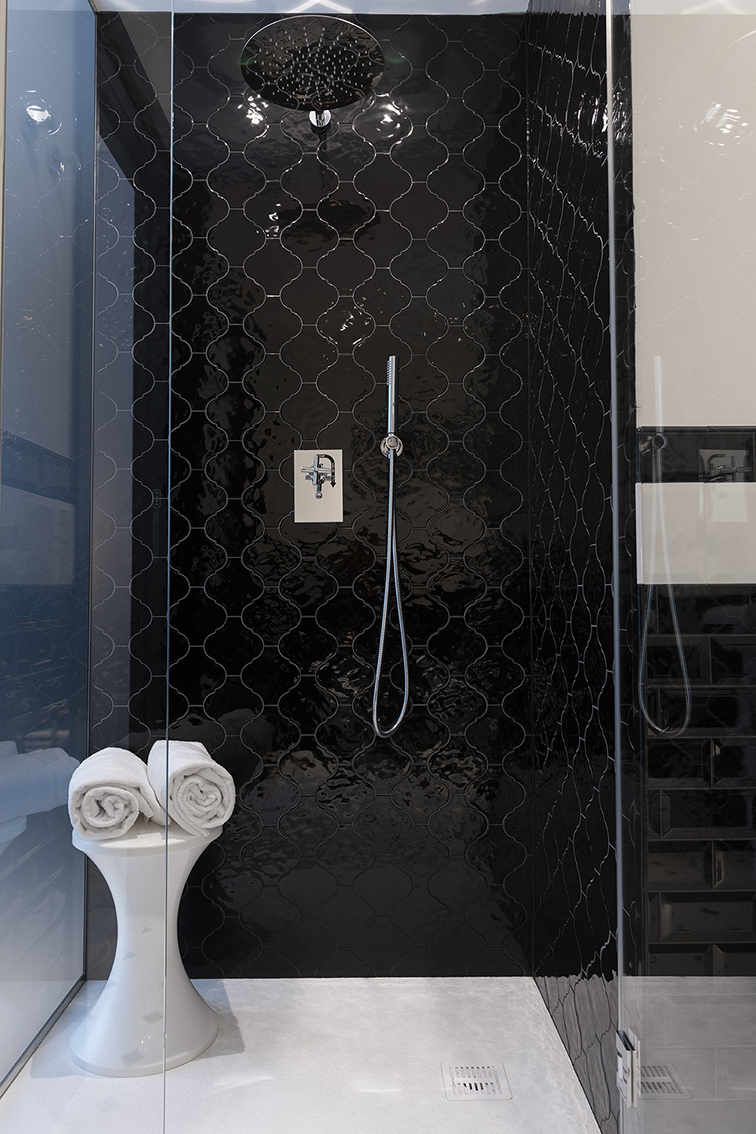
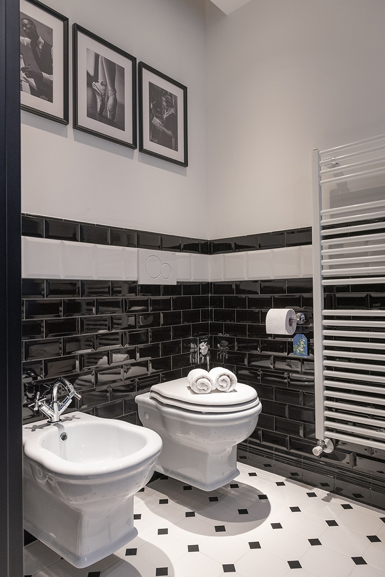
Locanda Appennino consist of a big restaurant, a winery room and five rooms all monochromatic with a game of extreme contrasts. Inside Locanda Appennino Black and white chase each other up walls, floors, furnishings and accessories, creating a game of alternation that gives great movement and depth at the space. Despite the monochrome tone, the rooms are all different from each other because the black and white games change their looks and volumes.
WHAT WE DID
- concept
- hotel plan
- forniture design
- art direction

